Fractalink - Maruti - Setting benchmarks for the automotive digital presence

REDEFINING THE BUYING JOURNEY FOR MARUTI SUZUKI
  • project-info-title
  • overview

    overview

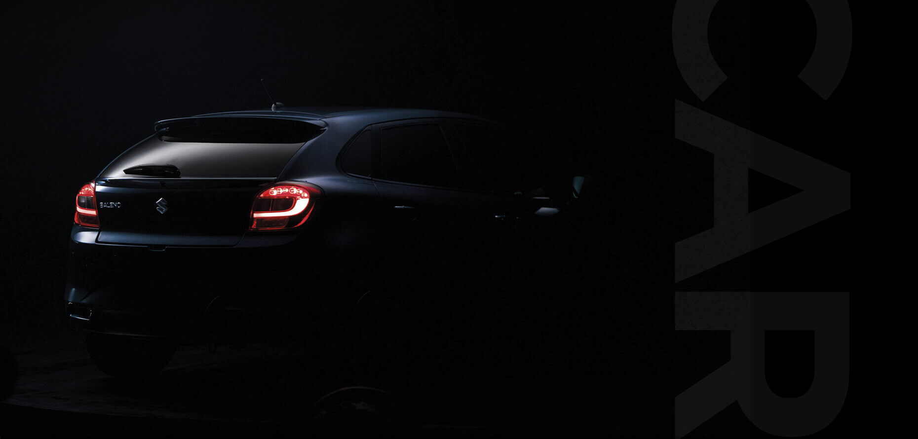
    One of the most popular and high selling car brands in the country, Maruti Suzuki underwent a major digital facelift last year.

    They felt the need to keep pace with changing consumer behavior who used the digital medium extensively to explore their option which meant that Maruti needed to engage their customers on this medium experience.

  • brief

    brief

    Research showed that customers used the digital medium during the exploration and consideration phases of the buying journey.

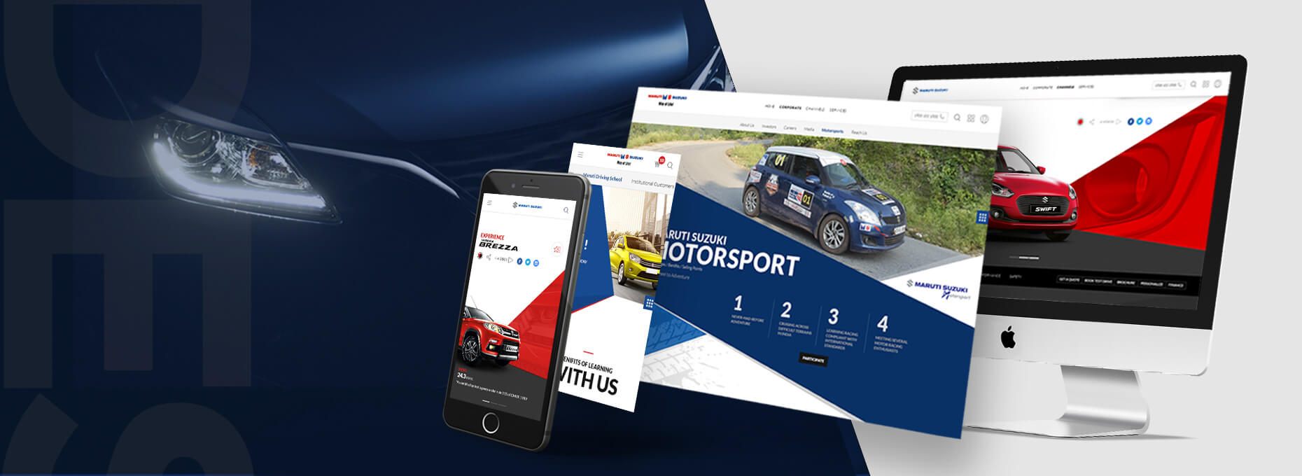
    The brief was therefore to create several digital assets that went together to create an omnichannel ecosystem for customers that traversed the web, tablet and touch screens in their showrooms.

  • challenge

    challenge

    A lot of automobile brands across the world have been revitalizing their digital properties and the benchmarks for creativity and innovation were already high.

    That combined with the mandate to create designs that can be easily maintained and scaled in the future posed a challenge that we had to meet.

  • strategy

    strategy

    The buying journeys of several personas were mapped in detail to understand and identify the points at which the buyer needed more details, needed handholding, and what point a visit to the showroom and a test drive became important.

    Features and Interactions were built for each of these identified needs to keep the user engaged.

  • innovation

    innovation

    We brought new thinking to every part of the customers buying journey; the compare feature that helped in the consideration phase to the Build my Car which helps customize and personalise the car.

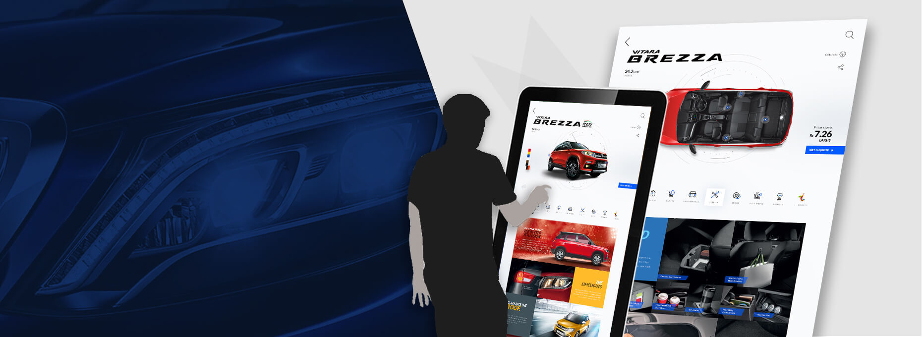
    As part of the Omnichannel experience, we built a large touch screen dealership experience that brought the cars to life.

STRONG VISUAL DESIGN LANGUAGE

STRONG VISUAL DESIGN LANGUAGE

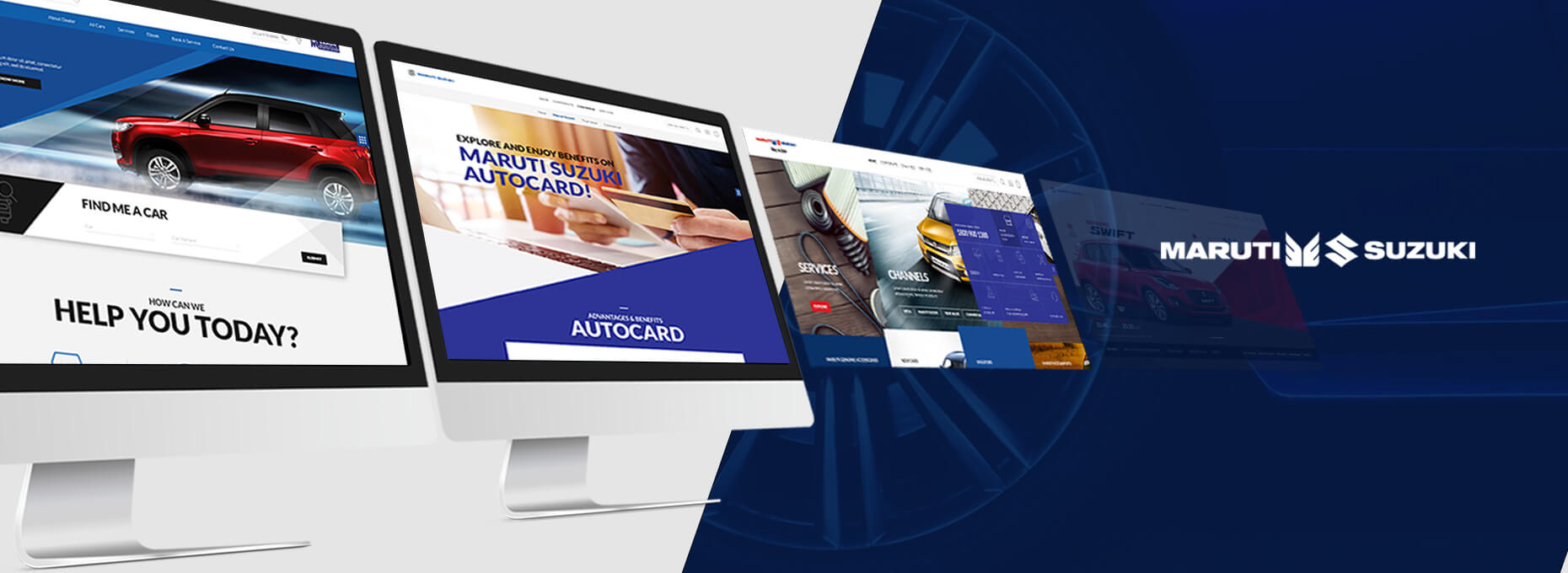
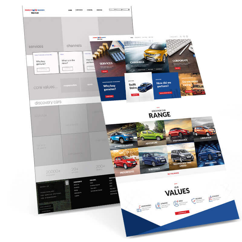
A strong and distinctive visual design language has been set for all the digital assets. It consists of using the brand colours effectively along with angled lines across all the pages. The fonts used, and the guidelines established for the kinds of imagery will enable the entire website and apps to have a consistent look.

TAILORED EXPERIENCES TO HELP IN THE CONSIDERATION PHASE

TAILORED EXPERIENCES TO HELP IN THE CONSIDERATION PHASE

We have crafted some experiences to assist and hand hold the buyer in the consideration phase. Functionality like compare cars and build my car helps to narrow down on features and accessories that are important to him and narrow down on the car of his choice.

HELPFUL WIDGETS

HELPFUL WIDGETS

Whether they are small calculators, or pop-ups that draw attention to the most common and useful journeys upfront for both, the potential buyer as well as the existing one the user experience has been planned and designed with care to provide an intuitive and pleasurable experience with as little friction as possible

OMNICHANNEL EXPERIENCE

OMNICHANNEL EXPERIENCE

One of the mandates of the entire exercise, we have designed journeys that transcend the device while giving the customer a continuous, seamless experience whenever and however he accesses Maruti Suzuki content.

INK'D

WITH THOUGHT AND CARE

  • ENTRY POINTS

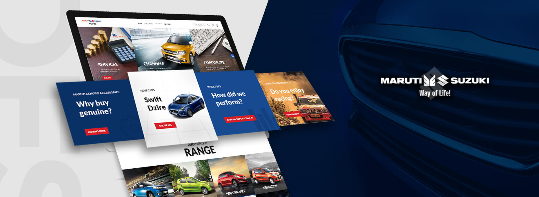
    The website has been designed to provide entry points to deep content upfront.

    Whether it is an existing customer who wishes to get his car serviced or renew his insurance to the potential customer who wants to discover the cars, book an appointment or customise his car the user is able to find the entry points to those journeys quickly.
    ENTRY POINTS
  • CAR SHOWCASE

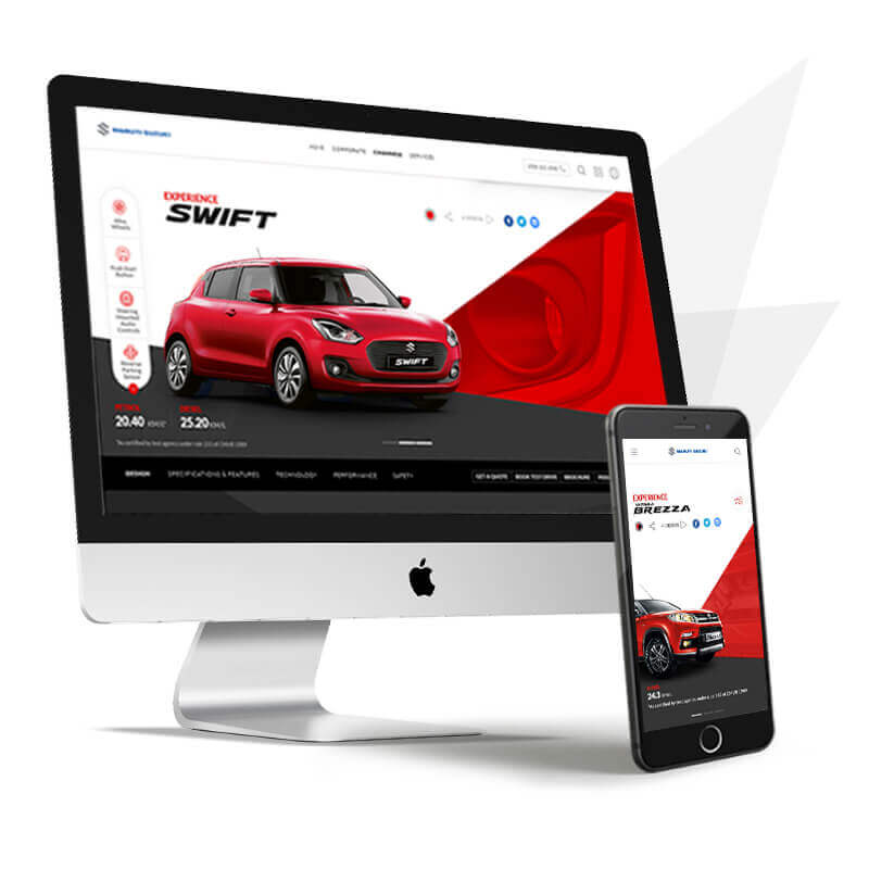
    One of the key objectives of an automotive website is to showcase its cars to the best possible advantage, highlighting its selling points and its features.

    The pages that are dedicated to the cars have been designed with great attention to detail from the images used to structuring the content on each page.
    CAR SHOWCASE
  • IN SHOWROOM EXPERIENCE

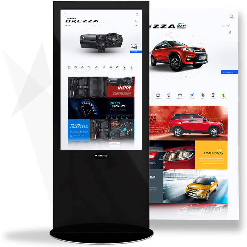
    Maruti came up with the Nexa brand to feature its high-end cars. Its showrooms needed to have the premium quality in the experience it provided. It is not always possible for a dealer to have all the cars in various colours and options in his showroom.

    We designed a large touchscreen interface for Nexa showrooms where the customer can interact with the interface to customise and build the car of their choice from its colour, interior finishes and other accessories.

    IN SHOWROOM EXPERIENCE
meter-reading
  • cups of <span class='cm-line-break'>coffee</span> 0 cups of coffee
  • blinks per <span class='cm-line-break'>hour</span> 0 blinks per hour
  • laptop <span class='cm-line-break'>charges</span> 0 laptop charges
  • social gatherings <span class='cm-line-break'>ignored</span> 0 social gatherings ignored
  • hours of <span class='cm-line-break'>travel</span> 0 hours of travel
  • raymond cover image

    STYLING MENis SERIOUS BUSINESS

    OMNICHANNEL EXPERIENCE DESIGN FOR RAYMOND

    raymond logo
  • catch-media cover image

    DATA MATTERS AND WE MAKE SURE YOU SEE IT RIGHT

    ANALYTICS AND PLANNING TOOL FOR MEDIA APPS

    catch-media logo
  • ddecor cover image

    Helping you to Live beautiful

    Omnichannel experience design for DDecor

    ddecor logo
  • niyogin cover image

    FINANCIAL ECOSYSTEM FOR THESMALL AND MEDIUM ENTERPRISE SEGMENT

    FINANCIAL ECOSYSYTEM FOR SMEs

    niyogin logo