WITH THOUGHT AND CARE
-
MOBILE FIRST APPROACHSIMPLIFIES CONTENT DELIVERY
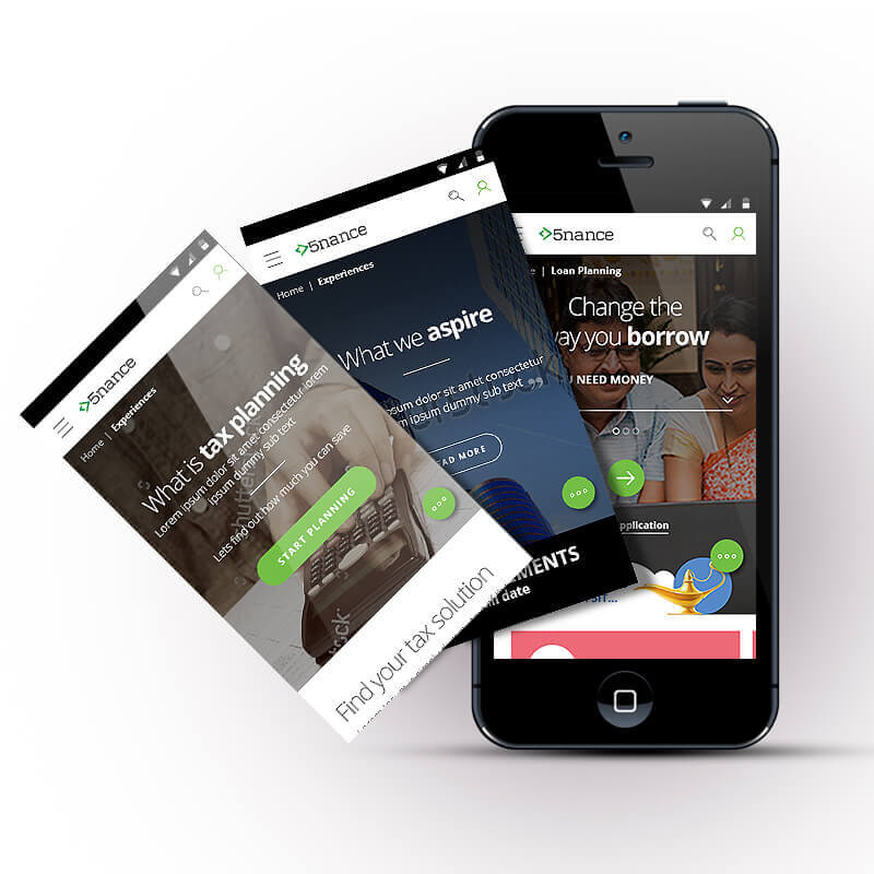
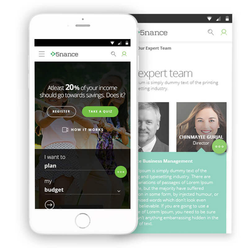
Right from day one the design was focussed towards mobile first. India as a nation is heavy on mobile usage and for many it is the primary or the only mode of communication. The grid planning was done in order to achieve the maximum out of a click on a vertical scroll.
-
BUILDING CREDIBILITY USINGPERSONALISATION AND KNOWLEDGE EXPERTISE
It good to substantiate users actions with experts reactions. We helped bring experts opinions contextual to users journey so that meaningful extracts can be made more relevant.
-
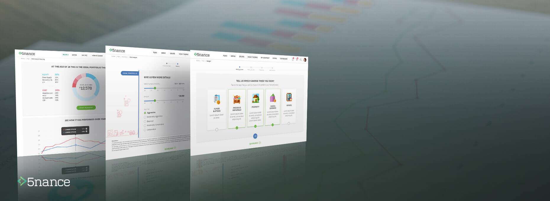
DASHBOARDS ALLOW USERSTO QUICKLY ASSES AND ACT
Maruti came up with the Nexa brand to feature its high-end cars. Its showrooms needed to have the premium quality in the experience it provided. It is not always possible for a dealer to have all the cars in various colours and options in his showroom.
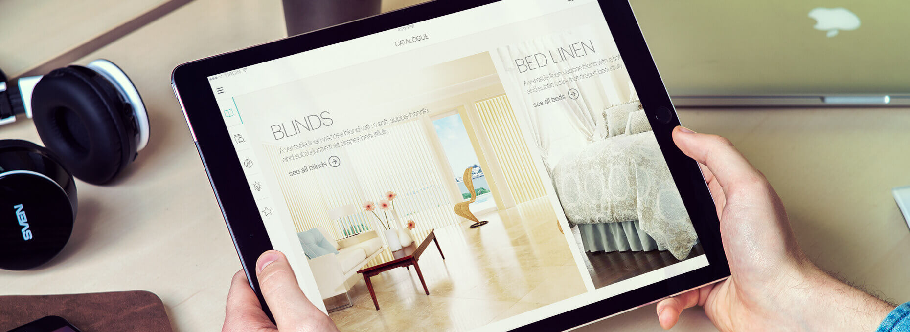
We designed a large touchscreen interface for Nexa showrooms where the customer can interact with the interface to customise and build the car of their choice from its colour, interior finishes and other accessories.
-
EASY CONTENT ARCHITECTURETO CATER TO LOWEST DENOMINATOR
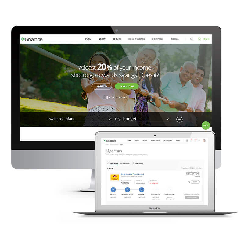
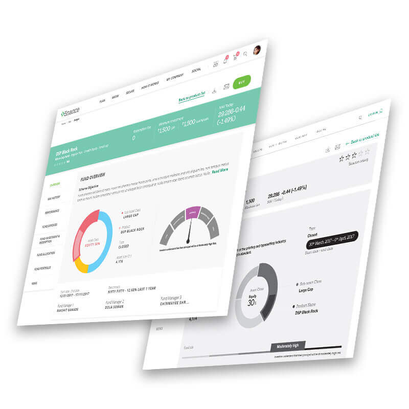
Overall Fractal Ink tried to simplify the Information architecture so that users could connect to it. The navigation was stripped to bare bone and the taxonomy was designed to reflect users frame of mind. Plan, Grow and Secure moneys are 3 starting points which connects to all age groups and provides a robust start to all journeys.
