Fractalink - Voot - OTT application for Viacom 18

OTT APPLICATION FOR VIACOM 18
  • project-info-title
  • overview

    overview

    Viacom18 Media Pvt. Ltd. is one of India's fastest growing entertainment networks and a house of iconic brands that offers multi-platform, multi-generational and multicultural brand

    experiences. It touches the lives of millions of Indians every day and distributes content on air, online, on ground, in shop and through cinema.

  • brief

    brief

    Viacom 18 wants to bring content from across all its channels to a single platform Voot. Fractal Ink was engaged to design a seamless.

    experience across the web, mobile phones and TV that helped users discover and consume content intuitively and easily

  • challenge

    challenge

    Discovery of content, given that new shows and episodes are added daily to an already vast database was the biggest challenge that had to be addressed. A kids safe layer had to be designed to cater to that very large audience base. Adding to the complexity was the objective of creating a differentiated experience.

  • strategy

    strategy

    We conducted extensive primary and secondary research to understand the space and audience behaviour. We broke down the content and put them into various buckets by genre, appeal, audience etc. We decided that each such bucket needed to be looked at separately and treated differently that one size would not necessarily fit all!

  • innovation

    innovation

    Each bucket was approached separately to see how people would look for them. The navigation and layouts, content descriptions under thumbnails etc were designed to aid in the process of discovery and to encourage the audience to click! The kids section led with characters as opposed to grown up sections by shows, channels or latest episodes.

CATCH UP TV ON THE MOVE

CATCH UP TV ON THE MOVE

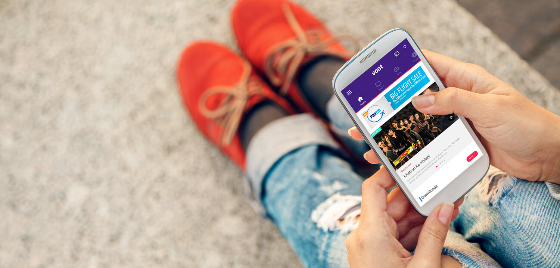
We designed a handy way to browse through other options the platform recommends as you are watching your favourite movie or show.

MOBILE FIRST APPROACH

MOBILE FIRST APPROACH

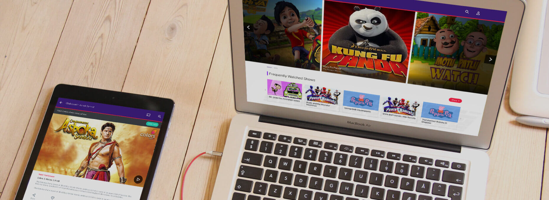
The platform was designed to cater to the growing popularity of small screens in India. Voot is a product of Viacom 18 and now is the only platform where you can watch content from the TV channels that they own.
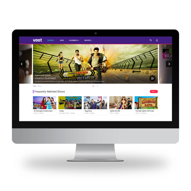
MAKING CONTENT THE KING

MAKING CONTENT THE KING

We redesigned the interface from a multicoloured experience to an interface that lets content take centre stage. The design language was reimagined using white as a backdrop that gives content opportunity to shine. Also it allowed it to be differentiated from NETFLIX.

JOURNEYS DESIGNED TO CATER TO KIDS TV

JOURNEYS DESIGNED TO CATER TO KIDS TV

Designing for Kids poses challenges of content curation and security. We designed special stories which allows kids to reach their content using their behavioural patterns. Superhero/character based browsing helped cut down on the complexity

INK'D

WITH THOUGHT AND CARE

  • A DESIGN THAT LEVERAGES ON OMNICHANNEL APPROACHFOR VIDEO ON DEMAND PLATFORM

    The platform was designed to cater to the growing popularity of small screens in India. Voot is a product of Viacom 18 and now is the only platform where you can watch content from the TV channels that they own.

    A DESIGN THAT LEVERAGES ON OMNICHANNEL APPROACH<span class='cm-line-break'>FOR VIDEO ON DEMAND PLATFORM</span>
  • PLATFORM AGNOSTICDESIGNS

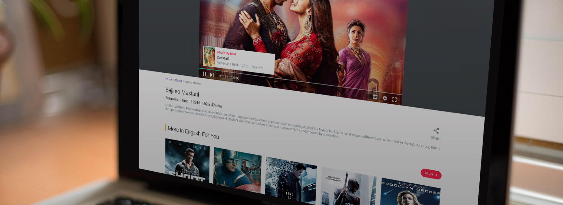
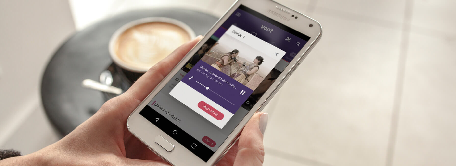
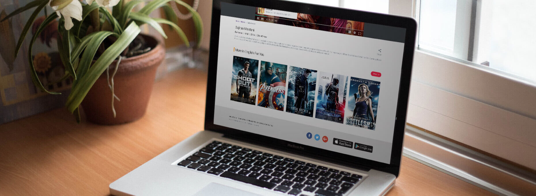
    In todays world a digital intervention cannot be designed independently on one platform. We designed VOOT as an ecosystem where the digital artifacts were designed to adapt as per the medium
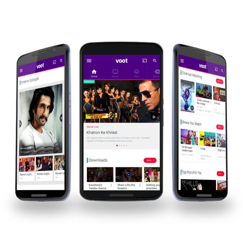
    PLATFORM AGNOSTIC<span class='cm-line-break'>DESIGNS</span>
  • BUILT UNIQUE TONE OF VOICE USINGVISUAL COMMUNICATION AND ILLUSTRATIONS

    Who says notifications and error messages have to be boring or forbidding. We created a whole family of illustrations that are uniquely VOOT and which make mundane screens interesting and engaging. This allowed the platform to build a relationship with the use of humour and visual style which is unique and interesting.
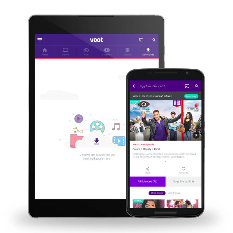
    BUILT UNIQUE TONE OF VOICE USING<span class='cm-line-break'>VISUAL COMMUNICATION AND ILLUSTRATIONS</span>
  • DESIGNS FOCUSED TOWARDS PROVIDING AUNIQUE DESIGNS FOCUSED TOWARDS PROVIDING A UNIQUE BUT SEAMLESS EXPERIENCE ACROSS PLATFORMS

    The design was envisioned as a system rather than screens. Since it was built grounds up, it allowed the designers to come up with a language which could be extended to various forms easily. Starting with mobile as a smallest form factor the design language was extended to Desktop and television as well.
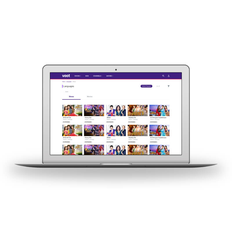
    DESIGNS FOCUSED TOWARDS PROVIDING A<span class='cm-line-break'>UNIQUE DESIGNS FOCUSED TOWARDS PROVIDING A UNIQUE BUT SEAMLESS EXPERIENCE ACROSS PLATFORMS</span>
  • SIMPLICITY IN INTERFACE DESIGNSBUILDS USER CONFIDENCE TO DIVE DEEPER

    The bottom line for any content based platform is to present as much content to the user in as easy way as possible. With content generated every hour discovery of content becomes a bigger challenge than display of content. Our approach to design was to encourage more consumption by reducing cognitive load from the user by simplifying.
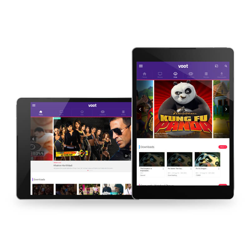
    SIMPLICITY IN INTERFACE DESIGNS<span class='cm-line-break'>BUILDS USER CONFIDENCE TO DIVE DEEPER</span>
  • BINGE WATCHING PROMOTED THROUGHBUILDS USER CONFIDENCE TO DIVE DEEPER

    In the current times we have variety of technologies such as AI and machine learning that allows to build systems with continuous learning foundations. The interface design allows the content to be mapped with consumers behavior and bring out deeply embedded content titles to the surface.
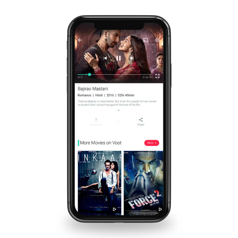

    BINGE WATCHING PROMOTED THROUGH<span class='cm-line-break'>BUILDS USER CONFIDENCE TO DIVE DEEPER</span>
meter-reading
  • cups of <span class='cm-line-break'>coffee</span> 0 cups of coffee
  • blinks per <span class='cm-line-break'>hour</span> 0 blinks per hour
  • laptop <span class='cm-line-break'>charges</span> 0 laptop charges
  • social gatherings <span class='cm-line-break'>ignored</span> 0 social gatherings ignored
  • hours of <span class='cm-line-break'>travel</span> 0 hours of travel
  • raymond cover image

    STYLING MENis SERIOUS BUSINESS

    OMNICHANNEL EXPERIENCE DESIGN FOR RAYMOND

    raymond logo
  • catch-media cover image

    DATA MATTERS AND WE MAKE SURE YOU SEE IT RIGHT

    ANALYTICS AND PLANNING TOOL FOR MEDIA APPS

    catch-media logo
  • ddecor cover image

    Helping you to Live beautiful

    Omnichannel experience design for DDecor

    ddecor logo
  • niyogin cover image

    FINANCIAL ECOSYSTEM FOR THESMALL AND MEDIUM ENTERPRISE SEGMENT

    FINANCIAL ECOSYSYTEM FOR SMEs

    niyogin logo